Write your resume in 15 minutes
Our collection of expertly designed resume templates will help you stand out from the crowd and get one step closer to your dream job.


The question "should I put my picture on my resume?" has a short answer that depends on where you live. But the real question is broader: what do all visual elements on a resume actually communicate: to a machine, to a human, and to the hiring system they operate in together?
A headshot, a phone icon, a five-star skill rating, a company logo, a QR code pointing to your portfolio. None of these is neutral. Each one is read differently depending on the market you are targeting, the role you are applying for, the channel you are using to apply, and the technology standing between your document and the person you want to meet.
Pictures on resume : 5 Visual elements. 3 Environments. 1 Decision per cell.
Before asking whether to include anything visual on your resume, you need to know which category it belongs to. The rules are not the same across elements, and they are not the same across contexts either.

The three environments that determine every decision:
- The market: the country and cultural context of the employer you are targeting
- The system: whether your resume passes through automated screening before a human reads it
- The role: whether your industry or position makes visual presentation professionally relevant
The Headshot: decision, choice, and insertion
The headshot is the most debated visual element on a resume, and the most poorly understood. The question is not simply "yes or no." It is "yes or no, given where, how, and for what."
Should I put a photo on my resume?
To answer that, you should examine three points of view, the environments in which you decide to apply.
Environment 1: The market
Environment 2: The application submission channel
Environment 3: The role and industry
The bias dimension: what the research shows
This is the dimension that most guides avoid. A headshot makes age, gender, and ethnicity immediately visible to any human reader, before they have read a single qualification. On English-speaking markets, where unconscious bias in hiring is documented across large-scale research, omitting a photo is not a gap. It is a strategic protection.
On these markets, many companies will automatically discard applications containing photos to eliminate their own legal exposure. You are not penalised for the absence. You may be penalised for the presence.
What makes a good resume photo?
If your market, channel, and role all point toward including a headshot, the quality of the image matters as much as the decision to include it. A poor headshot is worse than no headshot.
How to insert a photo in a resume (Word and PDF)
Getting the decision right and the photo right is not enough if the insertion breaks the document. This is where most candidates lose the technical advantage they worked for.
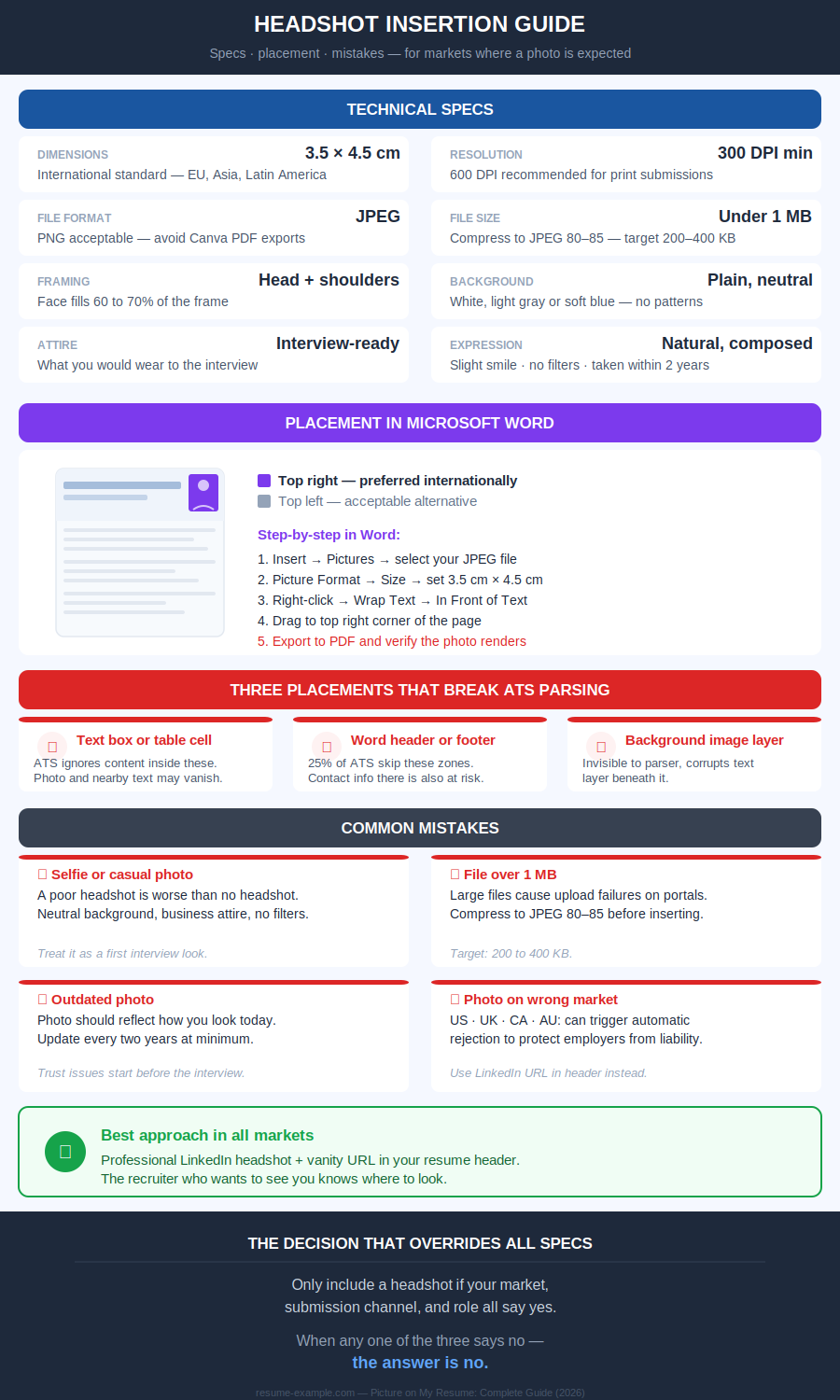
Step-by-step insertion in Microsoft Word:
- Open your resume as a .docx file
- Go to Insert → Pictures → select your JPEG file
- Click the image - Go to Picture Format → Size - set to exactly 3.5 cm wide by 4.5 cm tall
- Right-click the image → Wrap Text → In Front of Text
- Drag to top right corner of the header area (not inside the Word header zone)
- Save as PDF before sending - verify the photo appears correctly in the exported file
Contact Icons in resumes: why, what, where
The phone symbol next to your number. The envelope for your email. The LinkedIn "in" mark. They appear on thousands of resume templates and feel like standard professional design. Technically, they are the most common silent failure on a modern resume.
Can I use icons on my Resume?
Contact icons are never mandatory. No market, no role, no recruiter requires them. They are a design choice. And like all design choices on a resume, they carry a technical cost that most candidates do not see.
When a resume passes through an ATS parser, the system reads text as a linear string. An icon sitting next to your phone number is not text. Depending on the parser and the font used, it is rendered as a null character, a question mark, or a random symbol… sometimes corrupting the characters immediately around it. Your number may survive. The context around it may not.
Which contact icons are safe to use?
How to add icons to a resume without breaking ATS
If you choose to include icons for a human-first submission:
- Use Unicode characters from your keyboard or Word's Symbol menu (Insert → Symbol) - not image files
- Place the character immediately before the text it decorates, on the same line
- Do not use icon fonts (Font Awesome, etc.): they render as boxes or null in most systems
- Verify the plain text test: copy your resume into Notepad. If icons appear as boxes or question marks, replace them with nothing
Adding skill rating visuals on a resume
Five stars for Excel. Three dots out of five for Spanish. A progress bar at 80% for project management. These visuals look modern, structured, and informative. They are none of those things in practice.
Should I use Skill Bars on my resume?
Skill bars and rating visuals have two compounding problems:
- The first is technical. If a skill appears only as a visual element (a bar, a set of stars, a dot pattern...) the ATS does not register the keyword. The competency disappears entirely from the parsed document. A recruiter searching for "Python" in their system will not find you, even if you have a five-star Python bar on your resume.
- The second is credibility. What does three stars out of five mean for Spanish? Conversational? Business professional? Able to read a menu? The scale is yours. It has no external reference. A hiring manager with fluent Spanish who interviews you will know within thirty seconds whether your three-star rating was honest. A vague claim with visual packaging is still a vague claim.
What to write instead of skill rating visuals
There is no context in which skill bars serve the candidate better than plain text. The verdict is universal: replace every rating visual with a specific, verifiable description.
How to replace skill bars with text that works
The pattern in every replacement: the skill name in plain text (parseable), plus the specific context that makes it credible (verifiable). Both elements are required. Neither alone is sufficient.
Putting company and brand logos on resume
A recognizable brand logo next to a former employer's name adds instant visual credibility. It is also an element that most ATS systems silently ignore — meaning the logo itself communicates nothing to the software making the first screening decision.
Company logos on my resume: feasible ?
Which logos are acceptable on a resume?
One practical consideration that most guides omit: company logos are intellectual property.
Most former employers tolerate their use on candidate resumes and have never formally authorized it. In highly conservative sectors (legal, regulated financial services, government contractors…), logos of former employers on your resume can read as presumptuous rather than impressive.
- When in doubt, the company name in plain text is sufficient.
How to insert a logo in a resume the right way
If you include a logo for a human-first PDF submission:
- Source a high-resolution version from the company's official press kit or website (minimum 300 DPI)
- Insert as an inline image. Not inside a table, text box, or sidebar
- Size: no larger than the line height of the employer name beside it (approximately 0.6 to 0.8 cm tall)
- Align: left, immediately before or above the employer name in plain text
- The employer name must appear in plain text in all cases. The logo is supplementary, never a replacement
- Test: remove the logo mentally. Does the document still read correctly? It must.
QR Codes in a resume: what’s the usage
A QR code on a resume feels forward-thinking. It points to your portfolio, your LinkedIn, your GitHub. It suggests you have something worth showing. In practice, it serves almost no one reading your document.
Should I add a QR code to my resume?
Most resumes are read on screen, not printed. A QR code in a PDF opened on a laptop requires a second device to scan. It’s a friction that most recruiters will not accept when the URL is right there on the page anyway.
And when the resume passes through ATS first, the QR code is invisible: the link embedded in the visual is not extracted by any standard parser.
When Does a QR Code on a Resume Make Sense?
The safest and most universally effective approach: write the URL in full in plain text. Not a hyperlink alone. The full address, readable by eye, typeable by hand, parseable by ATS, clickable on screen.

Portfolio: yourname.com/work
LinkedIn: linkedin.com/in/yourname
GitHub: github.com/yourname
If you add a QR code for a print context, place it directly alongside the plain text URL — never instead of it.
How to Add a QR Code to a Resume (and When Not To)
- Generate your QR code at qr-code-generator.com or similar — free, no account required
- Set the target URL before generating — do not use a link shortener (they expire)
- Export as SVG or PNG at minimum 300 DPI
- Insert in the document footer area — small (2 cm × 2 cm maximum), discrete
- Write the full URL in plain text immediately below or beside the code
- Never insert a QR code in a text box or table — use inline image placement
The LinkedIn solution: Where your resume photo actually belongs
On LinkedIn, a professional headshot is expected, contextualised, and beneficial. Profiles with current, appropriate photos attract measurably more recruiter engagement than those without. On a resume submitted to an English-speaking market or through an ATS, the same headshot is a liability.
The bridge: include your LinkedIn URL in your resume header. A recruiter who wants to see you (And most will look!) knows exactly where to go. You give them access without imposing the image on a document that may be screened by software or reviewed in a market where photos are discouraged.
This is not a workaround. It is the correct professional architecture for 2026: the resume carries your qualifications, LinkedIn carries your presence.
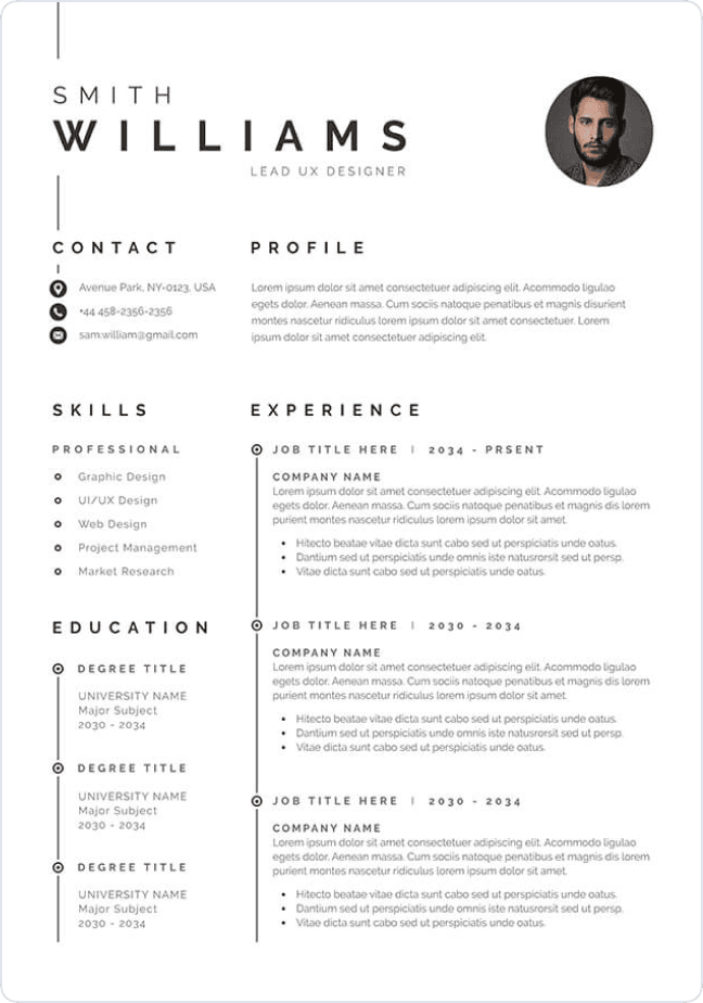
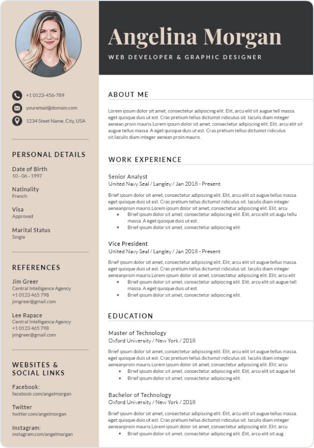
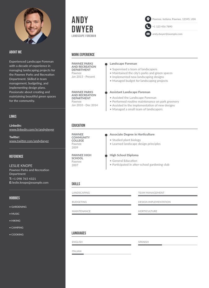
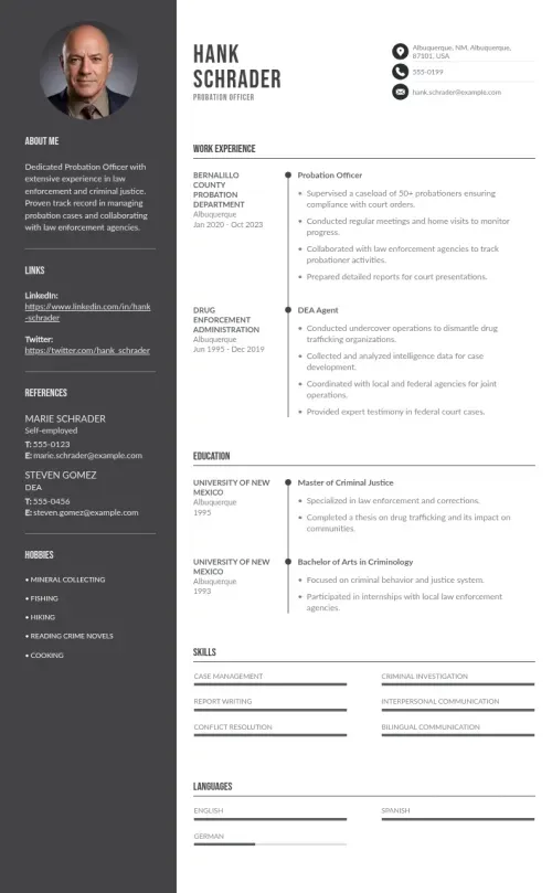
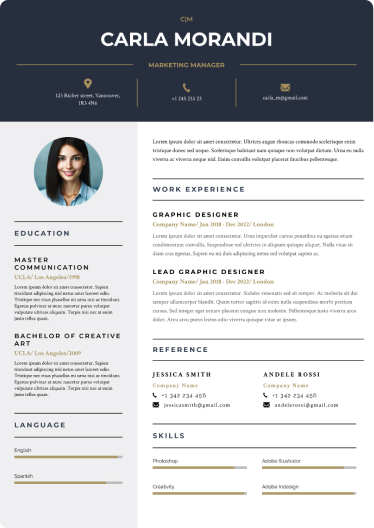
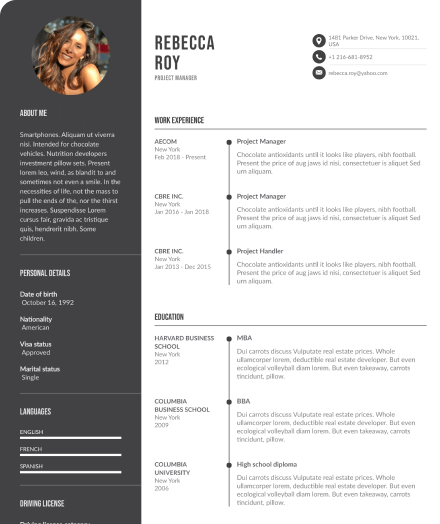
Using templates with photo spaces
Some of the templates on this site include a designated space for a headshot: Budapest, Perth, Rotterdam among others. They are designed for markets where a professional photo is standard practice.
Before using one, two questions determine everything:
- What market are you applying to? If US, UK, Canada, or Australia: then use a template without a photo space, or leave the space empty and reformat the header.
- How are you submitting? If through an online portal: use the plain text version of any template regardless of design. Photos in ATS submissions do not benefit you in any market.
Create your resume with the best templates