One-page resume format is the ideal. It's a fact, a common usage in all professional and non-pro environments… Yet most people still get it wrong. Too cluttered, too vague, not tailored enough. The cruel irony: the harder you try to fit everything in, the less recruiters see. One page isn't a constraint: it's a discipline.


[FULL NAME]
[Target role / Professional title – e.g., Digital Marketing Manager]
[City, Country – e.g., New York, USA]
[Phone – e.g., +1 917 555 4832]
[Email – e.g., alexandra.reed@email.com]
[LinkedIn – e.g., linkedin.com/in/alexandrareed]
[Portfolio / GitHub – e.g., alexandrareedmarketing.com]
Professional Summary
[Professional identity] with [X years experience] in [industry/domain], skilled at [skills/tools], resulting in [main impact].
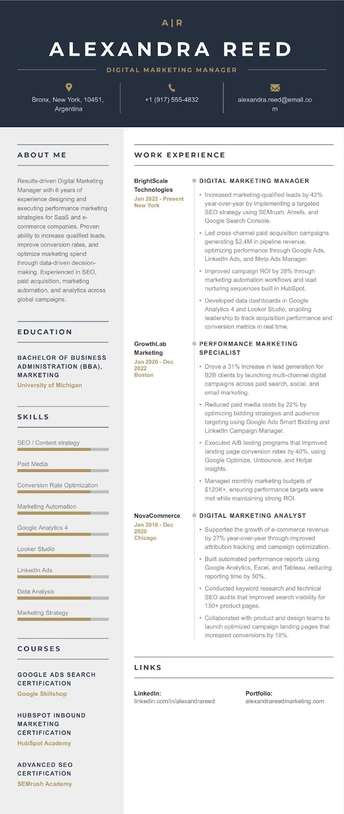
[E.g. Results-driven Digital Marketing Manager with 6 years of experience in SaaS and e-commerce, skilled at SEO and paid media, resulting in a 48% increase in inbound leads.
Key Accomplishments
Professional Experience
[Job Title – e.g., Digital Marketing Manager]
[Company Name – e.g., BrightScale Technologies], [City, Country] | [Dates – e.g., 2022 – Present]
[Previous Role – e.g., Performance Marketing Specialist]
[Company Name – e.g., GrowthLab Marketing], [City, Country] | [Dates – e.g., 2020 – 2022]
[Earlier Role – e.g., Marketing Analyst]
[Company Name – e.g., NovaCommerce], [City, Country] | [Dates – e.g., 2018 – 2020]
Core Skills
[Technical Skills] [Skill – e.g., SEO], [Skill – e.g., Data Analysis], [Skill – e.g., Paid Media]
[Tools & Platforms] [Tool – e.g., Google Analytics], [Tool – e.g., SEMrush], [Tool – e.g., Tableau]
[Professional Skills] [Skill – e.g., Strategic Thinking], [Skill – e.g., Communication], [Skill – e.g., Problem Solving]
Projects / Training
[Project Name – e.g., Customer Churn Prediction Model]
Education
[Degree – e.g., Bachelor of Business Administration] – [Field – e.g., Marketing]
[University – e.g., University of Michigan]
Certifications
Writing a one-page CV or resume has rules, but also exceptions. Switching careers and need to reframe your entire story? Stepping into the job market for the first time? A senior condensing decades of experience into a single page? The challenge isn't the same. Neither is the solution.
This guide breaks it all down: what to include, what to cut, how to format it… and real examples for every career to give you some perspectives.
A one-page resume is now standard, driven by modern recruitment speed. Recruiters spend only seconds on initial scans. Moreover, brevity is essential to pass ATS and grab human attention.
These next examples illustrate how to achieve maximum impact within this single-page constraint, optimizing for both machine readability and human engagement.
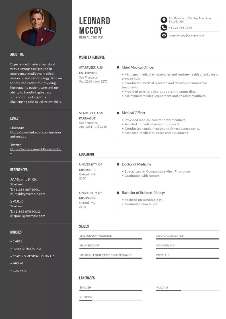
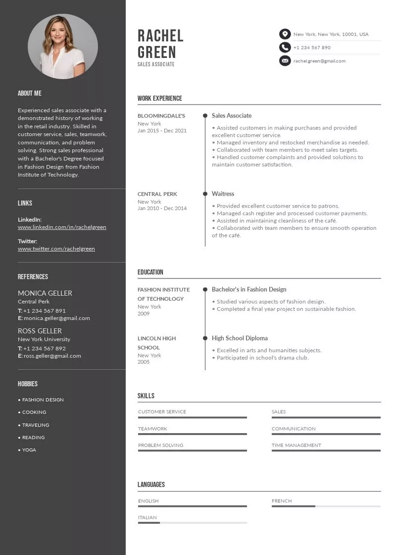
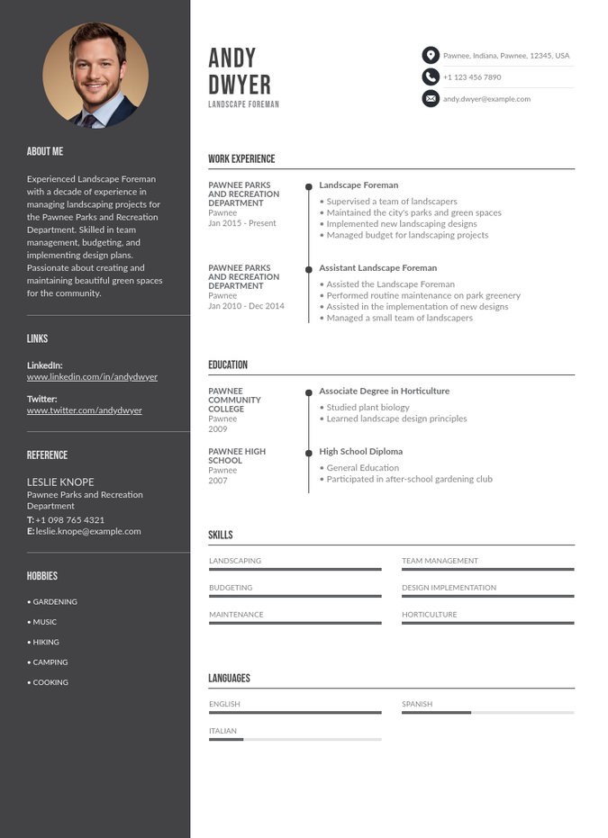
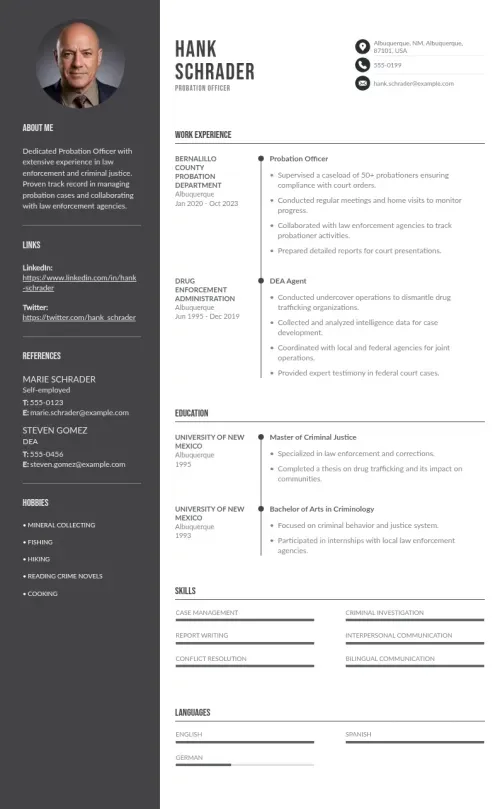
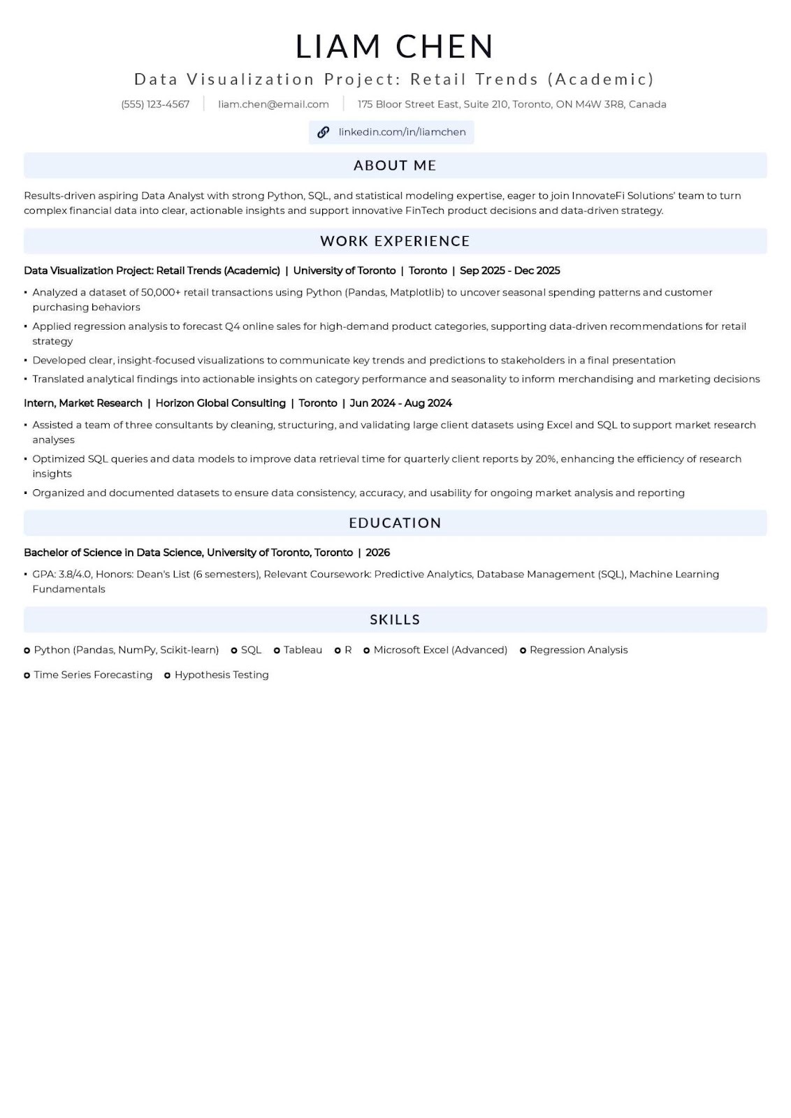
This format maximizes the visibility of academic achievements, transferable skills, and extracurricular leadership, which are often the main currency for candidates entering the workforce. When professional experience is sparse, focus shifts from "what you did" to "what you can do."
Mini-Tips for Entry-Level:
At this stage, the resume must demonstrate tangible value, career progression, and measurable impact. The focus shifts entirely to performance metrics and professional achievements, with education becoming secondary.
Mini-Tips for Mid-Career:
When changing fields, the resume's primary job is to bridge the gap, proving that previous skills are transferable and that the candidate has acquired the necessary new technical expertise.
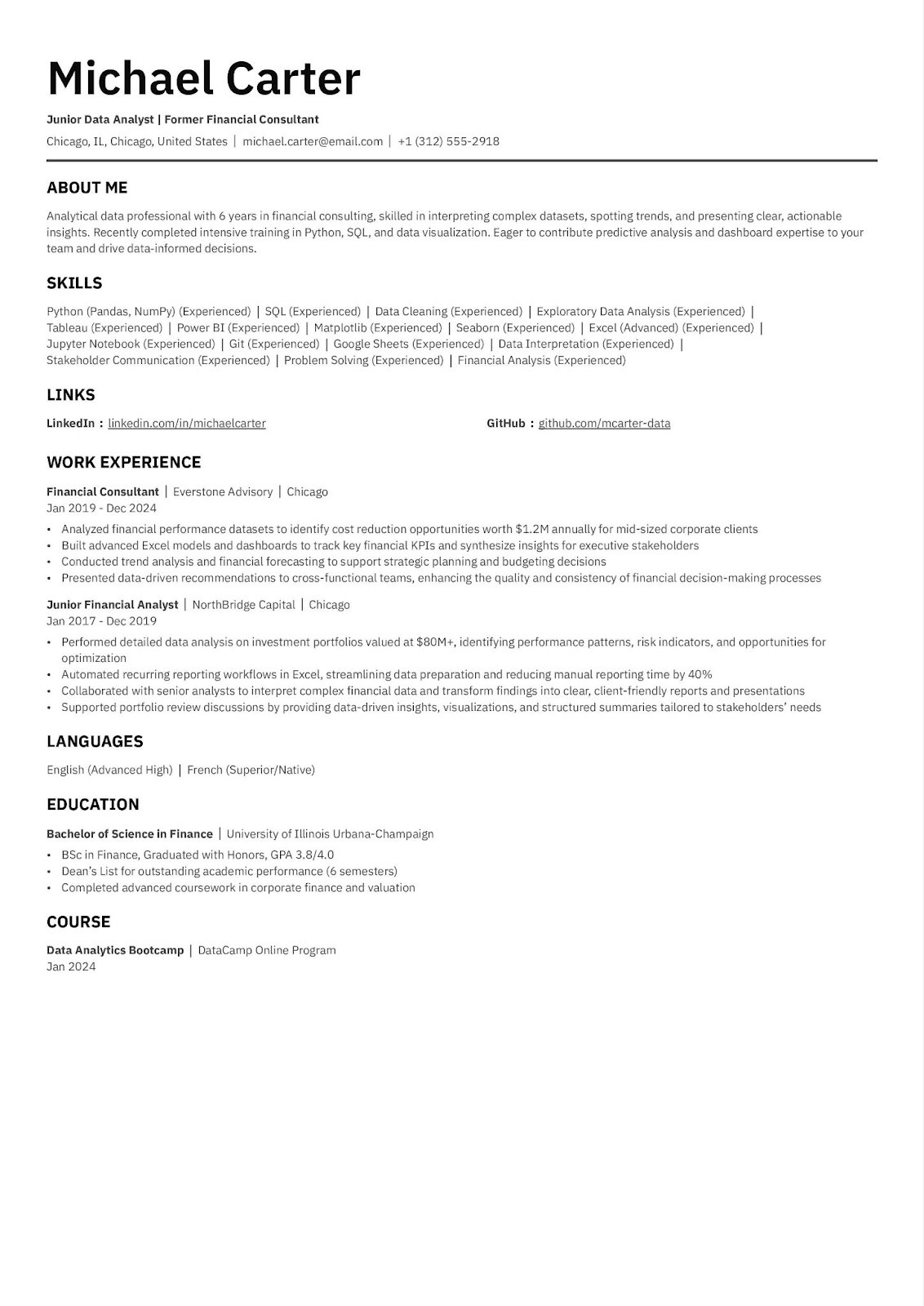
Mini-Tips for Career Transition:
Let's settle the debate first, because the numbers are messier than most guides admit.
On one side: more than a half of recruiters prefer a one-page resume for candidates with fewer than 10 years of experience. On the other: a separate 2025 survey of 1,013 HR professionals found that 51% now prefer two pages overall. Both stats are real. Both are cited by credible sources. And neither one is the full picture...
Here's what actually matters: recruiters usually spend less than 10 seconds on an initial scan (TheLadders Eye-Tracking Study, updated 2025). In that window, a focused, well-structured one-pager beats a sprawling two-pager almost every time. Not because of the page count, but because of the discipline behind it. One page forces you to prioritize. And prioritization is exactly what a tired recruiter reading their 80th resume of the day needs from you.
Our guide is built around the one-page discipline: what it demands, what it rewards, and how to make it work regardless of how your resume reaches the person reading it.
This is the step most resume guides skip entirely, and it changes everything that follows. There are two fundamentally different ways a resume gets read in 2026, and the rules are not the same for both.
You apply through a job board (LinkedIn, Indeed, a company careers portal…). Your resume is processed by an Applicant Tracking System before any human sees it. 98% of Fortune 500 companies declare using ATS (Jobscan, 2026). Roughly 75% of resumes are filtered out before reaching a recruiter (Harvard Business School, updated 2025). In this context, machine readability comes first. Design, columns, and visual flair are liabilities.
Your resume lands directly in human hands… no algorithm in between. This happens when you email a recruiter or hiring manager directly, get referred by someone inside the company, attend a career fair and hand over a printed sheet, apply to a small or mid-size company with no ATS, send an unsolicited application, or operate in a creative industry where design is part of the signal. In this context, visual clarity, typography, and human readability take priority.
The content is nearly identical: same achievements, same keywords, same structure. The difference is formatting and file type:
Maintaining both takes 30 minutes to set up. It saves you from the false choice of "optimized vs. beautiful", because those are only in conflict if you send the wrong version to the wrong audience.
When in doubt about which context you're in: default to the ATS version. It's the safer bet.
Both ATS systems and human readers rely on predictable structure, just for different reasons. The machine needs standard labels to categorize your information. The human needs a logical flow that answers their key question ("is this person worth calling?") as fast as possible.
The sections ideal order that works most for both:
This order works because it mirrors how decisions actually get made. Recruiters scan the top for basic fit (summary + skills), then dip into experience only if those pass. ATS systems are trained on the same sequence. Putting your strongest proof above the fold (before the reader has to scroll or flip) is the single most consistent piece of advice across every hiring study.
What to leave out, in both contexts:
The resume objective is not dead. But for most people, it's the wrong tool. Resumes with professional summaries receive far more interview callbacks than those with traditional objectives. Among career experts in 2026, the consensus is predominantly the use of a summary.
Why the summary wins in both contexts:
In an ATS application, the summary is prime keyword real estate: it's one of the first sections parsed and weighted.
In a classical application, it's the first thing a human reads, and it's your only chance to make them want to continue.
Either way, an objective statement, which focuses on what you want, wastes that space. Fundamentally, hiring managers don't care about your career goals in round one. They want to know what you bring.
The 3-sentence formula that works for both:
Digital Marketing Manager with 6 years driving performance campaigns for SaaS and e-commerce brands. Grew inbound leads by 48% through integrated SEO and automation; reduced customer acquisition cost by 35% via audience segmentation. Expert in HubSpot, Google Ads, and data-driven CRO.
 Weak objective:
Seeking a challenging position in digital marketing where I can utilize my skills and grow professionally.
The first one describes a track record. The other describes a wish.
The two cases where an objective still makes sense:
In the career transition case, your objective should acknowledge the change, show preparation (certifications, projects), and connect transferable skills to the new role, not just state that you're "looking for a new challenge."
One difference between contexts:
In a classical application, especially in a cover letter or email pitch that accompanies the resume, your summary can carry a little more voice and personality. You're talking to a person, not triggering an algorithm. Keep it tight (3-4 lines), but don't flatten it into a keyword list.
If you're in Context A (on-line application), ATS optimization is not optional. It's the admission ticket. Here's what to know:
Lots of ATS rejections are caused purely by formatting errors: tables, columns, and graphics that break parsing . You can be the strongest candidate in the pool and still be filtered out because your resume couldn't be read by the machine.
Identify 10-15 key terms from the job description: hard skills, tools, certifications, and job titles. Work them naturally into your summary, skills section, and experience bullets. Include both the acronym and the full term at least once (e.g., "Search Engine Optimization (SEO)").
Target 70-80% keyword match with the job description. Below 60% is likely to be deprioritized; above 80%, verify usage still reads naturally. Keyword stuffing (burying terms in white text or repeating them robotically) is flagged by modern AI-augmented ATS.
If you're in Context B (direct or hand-delivered application), ATS rules are irrelevant. Following them blindly can actually hurt you. Sending a sterile, column-free plain document to a hiring manager who reached out to you personally is a missed opportunity to make a real impression.
If your resume will be physically handed out at a career fair or interview, test-print it before the event:
This is where most resumes lose. Most bullets describe duties. The ones that get interviews describe impact.
The evidence is stark: including quantifiable achievements can considerably boost interview chances (up to 40% according to many hirers). Yet lots of resumes are still entirely missing measurable results…
Using The formula:
Action Verb + What You Did + How + Result
"Streamlined client onboarding using Salesforce automation, reducing setup time by 25% and improving first-month satisfaction scores by 18%."
Versus:
"Responsible for client onboarding."
The first tells a recruiter what happened. The second tells them nothing.
You almost always do. Ask yourself:
Approximate figures (For example: "~$2M pipeline," "15-person team") are better than no figures at all.
Never open a bullet with "Responsible for" or "Helped with." These are passive: they describe attendance, not contribution. Also, use variations to describe your missions and accomplishments:
Does the context (ATS vs. classical) change anything here? Slightly. In an ATS application, your verb choices should mirror the language in the job description for keyword matching. In a classical application, prioritize vividness and specificity over exact phrasing. A hiring manager reading cold responds to impact and clarity, not terminology alignment.
On a one-page resume, aim for at least 2-3 quantified bullets per role. Everything else is either a strong supporting detail or a candidate for deletion.
Hiring managers expect a skills section on every resume. Skipping it can undermine an otherwise strong application (Resume Genius, 2026). But it's also one of the most commonly mishandled sections.
Lead with hard skills, as ATS systems prioritize these, and human readers reach for them instinctively when assessing fit. Then add relevant soft skills, but only when backed up by evidence in your experience bullets. Aim for 12-15 skills that directly match the target role.
Group by category for scannability:
Data: Python, SQL, Tableau | Project Management: Agile, Jira | Communication: Executive Presentations, Stakeholder Reporting
Formatting is function, not decoration. A cluttered resume doesn't just look bad: it increases the chance a recruiter stops reading and decreases your ATS parse rate.
These rules apply in both contexts. The difference is that in a classical application, design can add to this foundation… in an ATS application, it can only subtract from it.
Getting to one page isn't about shrinking your font. It's about editorial discipline. Every line should earn its place by directly supporting your case for the target role.
The one-page constraint is the same for everyone. The strategy inside it is not.
When professional experience is thin, your priorities shift:
This is the sweet spot for one-page resumes. You have real achievements; the challenge is ruthless prioritization.
Your experience section tells the wrong story for your target role. The solution is framing, not hiding.
A classical application (emailing someone in your target industry who was referred to you) is often more effective than applying cold through a job board. Your cover email does the bridging work, and your one-page resume reinforces it. In that context, a well-designed human-first resume often outperforms an ATS-optimized one.
Most companies plan to use AI for reviewing resumes from now on (2026…). This adds a new layer on top of traditional ATS: AI systems that evaluate context, phrasing, and relevance.
This applies to Context A.
In Context B, a classical application, AI screening is irrelevant. But the underlying principle holds in both: write for humans first, and optimize from there.
Our collection of expertly designed cover letter templates will help you stand out from the crowd and get one step closer to your dream job.